
When @realdonaldtrump tweeted “If Chicago doesn’t fix the horrible “carnage” going on, 28 shootings in 2017 with 42 killings (up 24% from 2016), I will send in the Feds!”
And when FBI released a press report “Recorded 765 homicides last year, well above the 2015 total of 478. Violent crimes also jumped from 24,663 in 2015 to more than 30,000 last year. On top of homicides, Chicago also saw increases in 2016 in robberies, aggravated assaults, burglaries and motor vehicle thefts over the previous year.”
We got very interested and mostly anxious about the city we are living in. One day when we stumbled upon the Chicago crime data released by Chicago PD, we decided we could use tableau (basically to hone our skills better 😊) to visualize which areas of Chicago is actually very dangerous.
The data was pretty straightforward and there were not a lot of manipulations we needed to do, to get our desired visualizations. We took data only from 2012 – 2017 since our laptops (along with tableau) could not handle so much data. The data basically has all the demographics related to all the crimes which took place in Chicago from 2012 – 2017. It starts out with a Case number under which the case is registered and details of the location of the crime, time of the crime, type of the crime and its description and if whether the offender has been arrested or not.
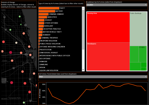
We started with a plan to build four visualizations, Map of Chicago being the master visualization and the rest of them refreshing according to the selection on the master. The Map of Chicago has circles representing districts (sadly, we do not have the names of the districts in the data and we did not want to make them up) with colors ranging from red to green, red being the most dangerous and green being the safest depending on the number of crimes that have happened over time. Once we select a district, the other three visualizations refresh. One being a Bar graph which shows us the different types of crimes in the order of most occurrences, another being a treemap with a drop-down filter – the location (Ally, Apartment etc.) where the crimes have taken place, the block where it took place, whether the offender has been arrested or not and the other is the line graph which shows the crime occurrences at different times of the day, times of the week, months of the year depending on what is selected from the drop-down filter. We did know that the south side of Chicago is very dangerous, but we were surprised to see that Downtown Chicago (we are assuming) is as dangerous.
The next steps are we plan to forecast the crimes in Chicago for the year 2018 using Time Series Forecasting in Tableau and also correlate them with the real estate prices. Also, let us know if you would like to visualize something, that may be something we are interested in too.
You can see the visualizations we made at https://public.tableau.com/profile/data.tales#!/
